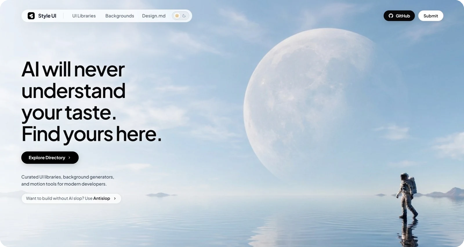
Style UI.
A modern headless UI component system built with Tailwind CSS and Radix Primitives for crafting accessible, modular, high-performance web interfaces without CSS-in-JS overhead.

Overview & Design Philosophy
Style UI is a React component library built on Tailwind CSS, engineered to blend modern aesthetics with enterprise-grade accessibility compliance. Unlike component libraries that impose monolithic opinions, Style UI adopts a headless primitives approach powered by Radix UI, granting developers full styling freedom without compromising keyboard navigation or screen reader support.
Components are architected on clean code principles, smooth micro-interactions via CSS variables, and an accessible copy-paste component registry pattern.
Component Architecture & Ecosystem
Style UI implements a layered modular structure separating interaction logic from decorative presentation:
- Primitive Foundation: Interactive state management (focus traps, ARIA attributes, keydown handlers) is governed by Radix UI Primitives.
- Utility Tokens: Styling is deterministically composed with Tailwind CSS utility classes, supported by CSS custom properties for dynamic theming.
- Compound Components Pattern: Complex patterns (such as Dialogs, Dropdowns, and Tabs) are exposed via compound components for flexible layout composition.
Installation & Usage
Style UI can be integrated through the NPM package manager or placed directly into your local components directory:
import { Button, Dialog, DialogContent, DialogTrigger } from '@style-ui/react';

export default function ModalDemo() {
  return (
    <Dialog>
      <DialogTrigger asChild>
        <Button variant="primary">Open Confirmation</Button>
      </DialogTrigger>
      <DialogContent title="Save Changes">
        <p className="text-sm text-zinc-400">
          Are you sure you want to save all system configuration settings?
        </p>
      </DialogContent>
    </Dialog>
  );
}
Key Highlights & Quality Standards
Every component undergoes exhaustive keyboard navigation testing, automated focus management, and ARIA role mappings aligned with accessibility specifications.
Free from heavy CSS-in-JS style injection overhead. Utility classes are compiled at build time by the Tailwind engine for zero runtime penalty.
Shipped with strict TypeScript definitions for instant IDE autocompletion and compile-time error prevention.
Native dark mode support and custom color palette configuration through CSS variables without hacking library internals.